Replicating Fantasian’s playing time visualisation
Rasmus Wiscostretford
2021-08-14
Source:vignettes/fantasianplayingtime.Rmd
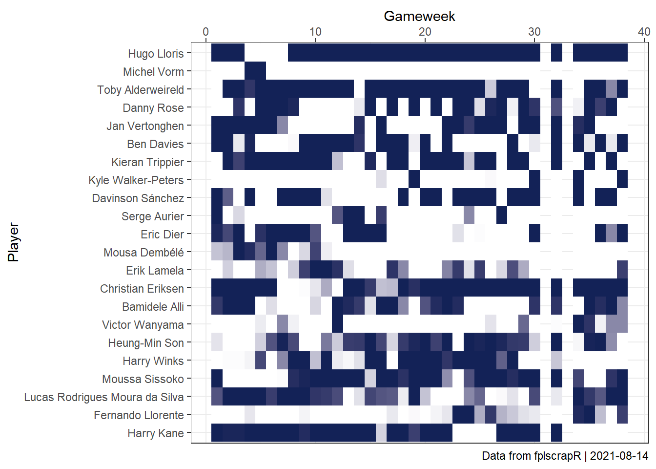
fantasianplayingtime.RmdSuppose we are interested in replicating Fantasian’s visualisation of playing time?
With fplscrapR, it’s just a few lines of code away. Here, we take the example of Tottenham players across the whole 18/19 season.
First, we fetch the player stats using get_player_details:
library(fplscrapR)

df <- get_player_details(season = 18)
Next we use dplyr and ggplot2 to transform and plot the data in a ‘tile’ format, showing the playing time for each player across gameweeks:
df %>%
  filter(element %in% 351:372) %>%  # selecting the 'elements' (players) from Tottenham
  ggplot() +
    geom_tile(aes(x=round,y=reorder(playername,-element),fill=minutes)) +
    theme_bw() +
    scale_x_continuous(position="top") +
    labs(x="Gameweek",y="Player",caption=paste("Data from fplscrapR | ",Sys.Date(),sep="")) +
    scale_fill_gradient2(guide=F,low="#FFFFFF",high="#132257") # filling each tile based on the 'minutes' value, from 'low' (white) to 'high' (the 'Spurs blue')
