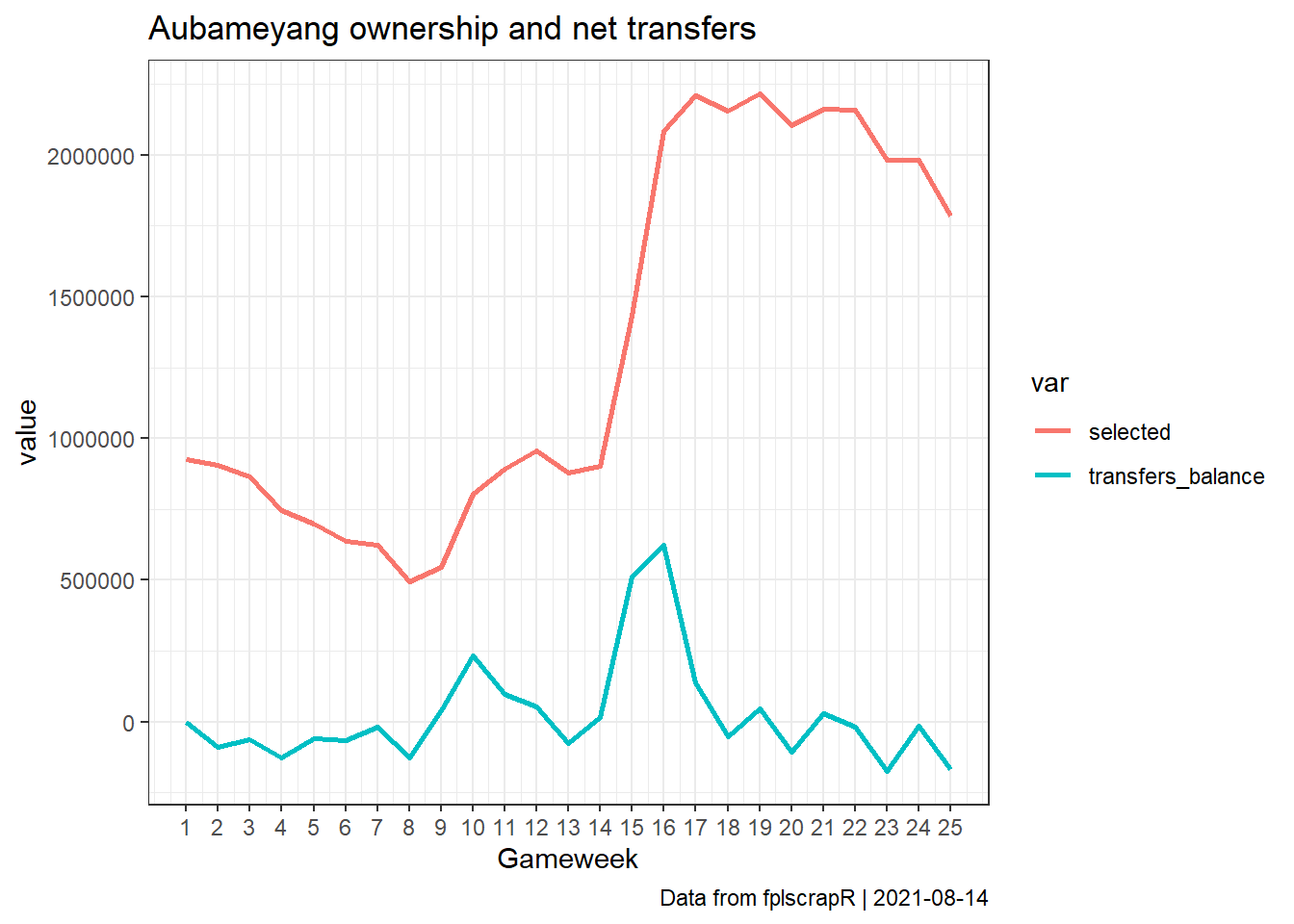
Aubameyang ownership and net transfers for the first 25 gameweeks
Rasmus Wiscostretford
2021-08-14
Source:vignettes/aubatransfers.Rmd
aubatransfers.RmdSuppose we are interested in how the ownership of Pierre-Emerick Aubameyang has changed through transfers over the course of the first 25 gameweeks of the 18/19 season?
First we fetch the gameweek-by-gameweek details of the player using get_player_details, mobilising the playerid using get_player_id:
library(fplscrapR)

df <- get_player_details(name="Pierre-Emerick Aubameyang",season=18)
Next we use dplyr, tidyr and ggplot2 to transform and plot the data, showing the total number of owners and net transfers out for each gameweek:
df %>%
  filter(round %in% 1:25) %>% # filtering for the GWs we are interested in
  select(round,transfers_balance,selected) %>% # selecting the relevant columns
  gather("var","value",-round) %>% # transforming from wide to long format for ggplot
  ggplot() + # plotting using ggplot2
    geom_line(aes(x=round,y=value,group=var,colour=var),size=1) +
    theme_bw() +
    scale_x_continuous(breaks=1:25) +
    labs(x="Gameweek",title="Aubameyang ownership and net transfers",caption=paste("Data from fplscrapR | ",Sys.Date(),sep=""))
