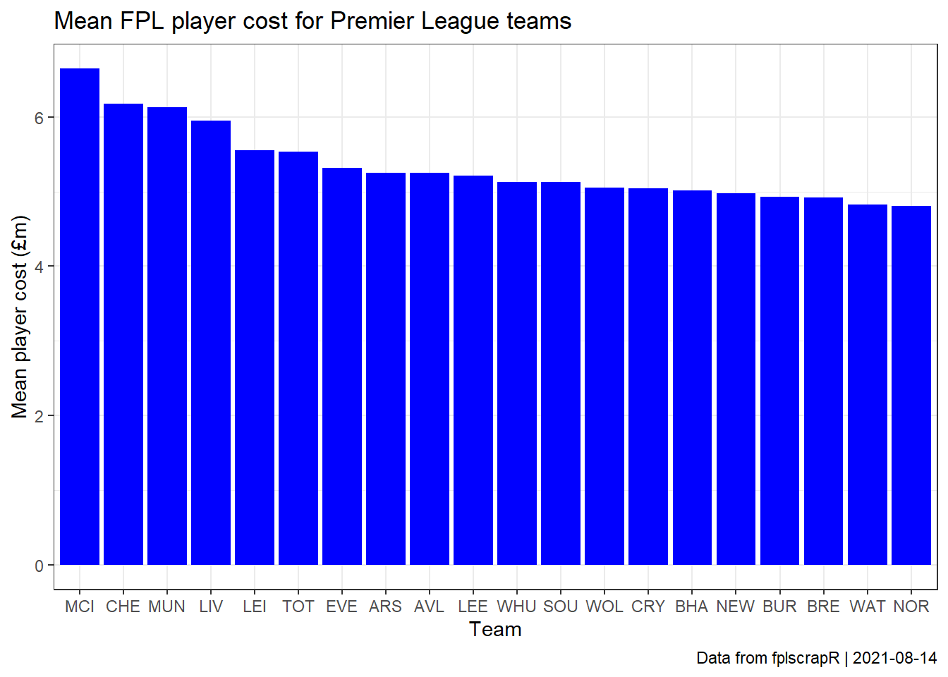
Most expensive teams by average FPL player cost
Rasmus Wiscostretford
2021-08-14
Source:vignettes/avgfplplayercost.Rmd
avgfplplayercost.RmdSuppose we are interested in comparing which Premier League teams have the most expensive FPL players on average?
First we fetch the full summary data on all FPL players using the get_player_info function:
library(fplscrapR)

df <- get_player_info()
Next we use dplyr and ggplot2 to transform and plot the data, ranking each Premier League by its average FPL player cost:
df %>%
  select(id, team, now_cost) %>% # selecting the relevant columns
  mutate(now_cost=now_cost/10) %>% # transforming the cost to millions (for some reason the FPL data structures FPL cost as 100.000s)
  group_by(team) %>% # transformation to group and mean-summarize the costs at the 'team' variable level
  summarize(mean=mean(now_cost)) %>%
    mutate(teamshort = get_fdr()$short_name) %>% # using the short team names from the get_fdr function instead of codes %>%
    arrange(-mean) %>% # arranging by the mean cost
    ggplot() + # plotting using ggplot2
    geom_col(aes(x=reorder(teamshort,-mean),y=mean),fill="blue") +
    theme_bw() +
    labs(x="Team",y="Mean player cost (£m)",
      title="Mean FPL player cost for Premier League teams",
      caption=paste("Data from fplscrapR | ",Sys.Date(),sep=""))
